Resource: Intersectionality Spectrum

I created a model to help visualise “degree of difficulty” based off the snakes and ladders picture below, so that it can be taken into account when looking at “merit”.

Please note the number of ladders for the person at the top of the image compared to the number of snakes at the bottom of the image.
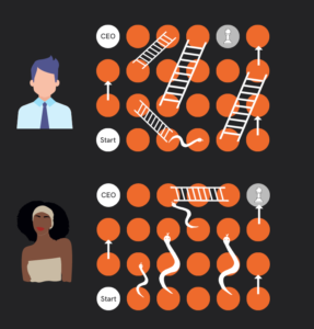
Picture of a white man and a black woman playing snakes and ladders with different boards. The black woman has many more snakes than the white man and less ladders. In one instance for the white man, there is a snake that ends on the bottom of a ladder to represent someone doing badly but still getting a promottion - this is called 'failing up' eg. Donald Trump. It also shows that the white man is just ahead of the black woman in his career, but who has done the best to get to that position based on the degree of difficult of their board? This is to the side of an orange vertical line and text

But the risk is that this will dehumanise and this needs to be kept in mind as we continue. This is why we have to remember that “All models are wrong but some are useful” – George Box. Box, G. E. P. (1979), “Robustness in the strategy of scientific model building”, in Launer, R. L.; Wilkinson, G. N. (eds.), Robustness in Statistics, Academic Press, pp. 201–236, doi:10.1016/B978-0-12-438150-6.50018-2, ISBN 9781483263366.

The picture below is the Intersectionality Spectrum to help people become aware of how belonging to more than one marginalised group impacts your degree of difficulty. Please note that every Intersectionality Spectrum has to be contextual. That means that the model isn’t fixed, it is highly contextual and created to fit the situation you are focusing on.

Degree of Difficulty is calculated to tbe 2 to the power of the number of marginalised groups a person belongs to. Use base 3 for highly marginalised groups. So in the image below a white male that belongs to no marginalised groups would be 2 to the power of 0, or 1. A disabled First Nations woman would be 3 to the power of 3 which is 27.
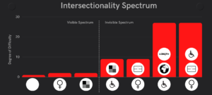
Intersectionality spectrum with different categories of intersectionality along the x-axis and the degree of difficulty shown as a bar graph on the y-axis. Displying icons in white circles denoting first nations, LGBQTI+, race, poverty, the Global South, mental health, disability, and gender where the more circles a person has, the higher their degree of difficulty. Please note that every Intersectionality Spectrum has to be contextual. That means that the model isn't fixed, it is highly contextual and created to fit the situation you are focusing on.

Most DEI initiatives target gender equity. The graph below points to the second least degree of difficulty and highlights that most DEI initiatives target gender equity and actually help white women more than others.
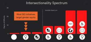
Intersectionality spectrum with different categories of intersectionality along the x-axis and the degree of difficulty shown as a bar graph on the y-axis. There is a dotted vertical line that separate visiable spectrum from invisible spectrum. There is an orange box that says "Most DEI initiatives target gender equity" and there are three orange arrows pointing to the white women symbol. This is because they benefit the most, and other non-white women do not.
Intersectionality spectrum where gender equity is the focus tends to focus on white women. Want to share this? Use DOI: https://zenodo.org/doi/10.5281/zenodo.10929139

This is why the image below shows 3 arrows pointing down on the bars that have the highest degree of difficulty to signify that we need to prioritise support to those who need it most because they have been discriinated the most. It has one green arrow pointing down to those with smaller degrees of difficulty to signify we still need to help those people as well, but with less intensity or frequency. This is similar to how a hospital should triage patients, in that we need to look after the sickest people first.
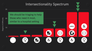
Intersectionality spectrum with different categories of intersectionality along the x-axis and the degree of difficulty shown as a bar graph on the y-axis. It shows 3 arrows pointing down on the bars that have the highest degree of difficulty to signify that we need to prioritise support to those who need it most because they have been discriinated the most. It has one green arrow pointing down to those with smaller degrees of difficulty to signify we still need to help those people as well, but with less intensity or frequency. This is similar to how a hospital should triage patients, in that we need to look after the sickest people first.
Intersectionality Spectrum that shows we should be triaging to help those who need it most, like a hospital. Want to share this? Use DOI: https://zenodo.org/doi/10.5281/zenodo.10929145


RM